Make a Theme for HERO Keyboard
If you'd like to make a theme for HERO Keyboard, here's the deal: You won't receive any money for your theme, I can list a by-line under your theme that links to whatever URL you want, so hopefully it can be a lead generator for you. And I'll give you a promo code to get HERO free if you don't already have it.
How to make a theme
1. Email your idea to me
Before you make the theme, first email corey@herokeyboard.com to let me know what you'd like to make. This is to avoid wasting your time making a theme that I may not want to use (eg, if you said, "I have a great photo of a trash can lid that I'd like to make into a theme." Then I'd say, "Hmmm...Thanks, but I don't think enough people would want a trash-can-themed keyboard." So my main criteria is that the theme is:
- something a decent number of people would like to have as a keyboard, and
- it doesn't use any copyrighted content (unless you own the copyright)
Theme do's and don'ts:
- Your theme could be based on a photo, illustration, Photoshop magic, etc.
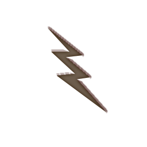
- You don't have to use a lightning bolt in the center (ie, the center can be whatever works for your theme, like the Daisy center).
- The rings can be anything that visually divides the circles. You could give each letter its own bordered area if you prefer.
- The letters can be any color you want, but they must all be the same color, and make sure there's enough letter:background contrast for readability even in outdoor light.
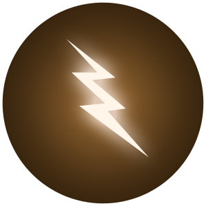
- When the user holds or force-presses the center (bolt) button, the Bolt-Menu appears. The Bolt-Menu always has white numbers and symbols on it, so you must give it a dark-enough background for white characters to be readable.
2. Get the Photoshop template files
Download the 35 MB HERO-Public-Templates.zip, which has PSD files and example PNGs. If you don't use Photoshop, use the PNGs as the template.
3. Make the Letter background and Bolt
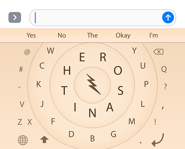
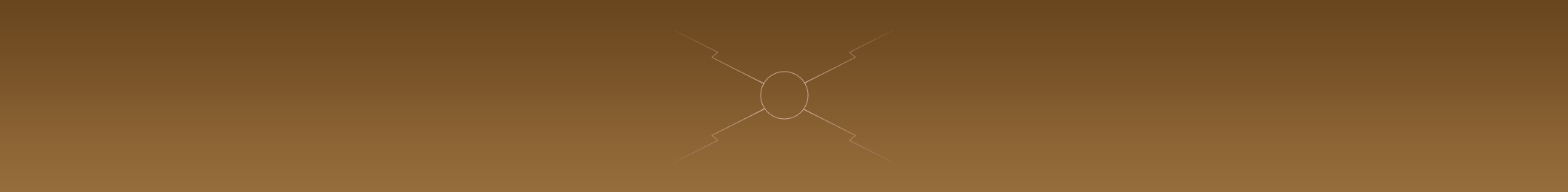
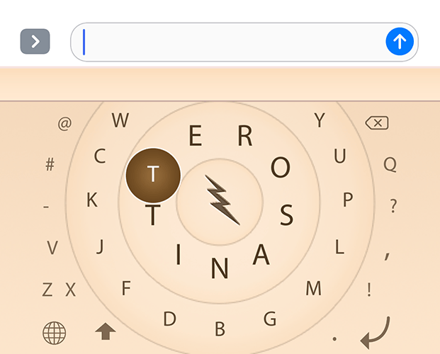
In Letter view, the letters and symbols are rendered by the app, so the image has only the rings and background graphic like this below (click it to view full size). The extra width on the sides will rarely be seen (basically only in landscape view), so you might as well just fade to a solid color or horizontal gradient to reduce file size. You'll probably want to design the Bolt button at the same time, but hide it when you export the PNG. Export it as a non-transparent 2119 × 260-pixel 8-bit PNG named "main_background_yourthemename.png"
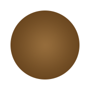
The Bolt icon (or whatever you choose to make it look like) is a separate PNG because it has both Off and Active (on-touch) states. Export it as a 300x300-pixel 24-bit transparent PNG named bolts_yourthemename.png and bolts_active_yourthemename.png
4. Make the Bolt-Menu background
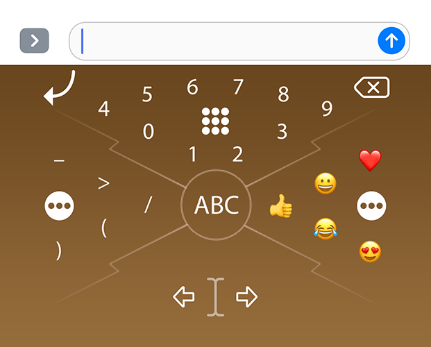
The background image file is pretty simple, with just a center circle and some type of divider for the four sections. The characters will always be white, so the background must be dark enough for the white characters to be easily readable. Export it as a non-transparent 2119 × 260-pixel 8-bit PNG named "menu_background_yourthemename.png"
5. Make the "Other" background (this one's easy)
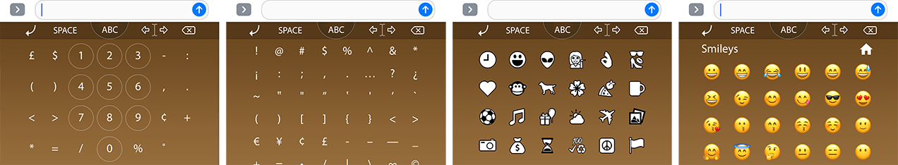
The "other" background is behind the numbers, symbols, and emoji views. It should be simple and non-distracting, probably similar to the Menu background since the user enters the Other views from the Menu. Note the tray at the top as well. Export it as a non-transparent 2119 × 260-pixel 8-bit PNG named "other_background_yourthemename.png"
6. Optional: Make the Extended-character background tray
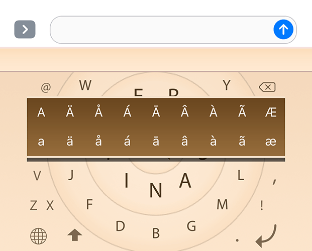
When you hold or force-touch on some characters, a tray of rarely used extended characters appears. The characters are white, so make your graphic is dark enough. Export it as a 715 × 145-pixel 24-bit transparent PNG named "extended_page_background_yourthemename.png"

7. Make the key-touch popup circle
When you tap a letter, it appears in a popup circle as feedback. The letter will always be white, so make your popup dark enough while also making it stand out from the background (I often use a use a strong stroke color, and a shadow). Export it as a 180x180-pixel 24-bt transparent PNG named "btn_popup_background_yourthemename.png"
8. Send the files to me
Zip and email me the files and the hex value of your letter color to corey@herokeyboard.com. Then give me a few days to check your files, create the necessary related files, and upload it into the app.
Questions?
No problem - just email me at corey@herokeyboard.com.